Wednesday, 11 November 2009

Project 2 -Using InDesign


Ive been using InDesign differently to the first project by experimenting with shape layers and patterns,hopefully to give me ideas for a logo as I will be designing one for my blank brief .Currently I have been just using my initials and random letters and numbers . here are some of my results below:


Out of my logo designing i preferred the effect of the G by increasing the weight of the stroke around the font it creates a interesting shape around it and makes it interesting to look at.
I also like the use of thick lines and dots by increasing the weight maybe not for my logo but it is something I wull keep in mind for my creative brief

Project 2 - Designing a Creative Brief

Project 2: Design & Develop A Creative Brief

There are two stages (A & B) to Project 2:

A) You are working for a media/PR agency. The creative brief the agency use is out of date and requires re-styling & designing. You are asked to re-design the brief using Adobe In design.

• Your creative brief must have a brand identity for the (imaginary) agency. With this in mind you will create the corporate identity (eg. name of agency /logo) and also add appropriate and considered style, colour, structure, and layout to all the component parts of brief.

B) You will choose one unformatted piece of ‘live’ creative briefs copy to provided your client information
Ted Baker or, Brylcreem .

You will then edit the copy, organise and present this information onto the blank brief for the agencies ‘creative team’ who work are working on the contract.

Project 1- Redesigning the Article Rough Results

This is my redesigned article . I have cut down the pages and made more use of photos and quotes to make the text more interesting to look and and read


Project 1 Copying the Article Rough Result

This is my rough finalised piece of the magazine there are still a few issues like the spacing and the font of the title and drop capital in which I will look into correcting but this is the current final piece otherwise.


Project 1 - Redesigning the Article Progression Page 6 and 7


The last page has a lot of spare space after the text was placed.
However due to the nature of the layout some of the photograpghers and clothes couldnt get mentioned where they were originally so I decided to put them at the end.As in a real working environment all people and items contributed to the article must be mentioned to make sure not to anger peole when published .


There was still a lot of space when the people were added so i decided thast adding another quite from the text would be eye catching a fill some of the page out a bit more


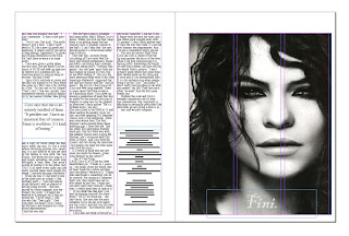
Once this was done I thought the original front picture would work well as a kind of "end cover" of the article clearly defining the ending of the article.


Project 1 -Redesigning the Article Progresson Page 4 and 5


This is the rough design of page 4 and 5 This at first still looked an ovberwhelming amount of text so I decided to add another photo to the pages to make it look more interesting

However this still looked a bit overwhelming so i added to quotes within the double spread to break things up


Project 1 -Redesigning the Article Progresson Page 2 and 3

I thought i would incorporate more pictures into the article but decide not to make them full page pictures like before as it took up a lot of room and made the feature go over ten covers that in my opinion over whelm the reader.
Below are some of the ideas of the rough layout i had for page 2 and 3


Project 1 -Redesigning the Article Progresson Page 1

Based on the layout I created as a rough idea I followed it to see how the magazne would look .
However as going through i changed some ideas and added more pages to fit the text on .Here are some screen shots of my progression on page 1


I first chose to use the original front cover page of the original however this time i wanted the photo and title on the same page.As you can see this phot didnt give the same effect so i decided to chose a different one from the article.


This photo worked much better so i decided to experiment with the positioning of this picture with the text and intro that was originally on the previous page in the other layout


As i am still figuring out how to get a font as good as the original I also have experimented with some of the fonts


From this I found that I prefer the title above the photo and the intro below

Wednesday, 4 November 2009

Project 1 Thoughts About Redesigning the Article


Considering I am nearly finished replicating the magazine I have been watching some videos on youtube for information and inspiration:


From this i then considered the previous layout and did a rough idea how the new layout could look. the key is the boxes are either quotes or titles the boxes with crosses in are pictures and the grey looking boxes are where the text will be .


The Text shown if not readable says:


Project 1 Progression

Today i have been carrying on trying to recreate the magazine , I retouched the photos by using the clone tool to remove the text on the scanned images and then replaced it with text on InDesign. I also removed the gaps between the paragrapghs appearing on the last page (possibly seen in the previous post).The article is near enough done now and is starting to resemble the original ,the only thing i have now been searching for is the font to go on the front page for the title 'Coco' and the drop capital 'I' .It is a unique font to the magazine so therefore i have to find one to resembe it as closley as possible.
I have been looking on dafont.com and found this particilar font that was the closest match i could find at the moment so it is a posibility to use for the title : www.dafont.com/font.php?file=bewitched&page=1&nb_ppp_old=10&text=Co+Co&nb_ppp_=10&psize=l&classt=alpha
I am going to continue looking for a font for the 'I' as it that font doesnt look as intricate as the drop capital in the magazine.